Protocol 3.2: Adhere to mapping standards
The following mapping parameters need to be adhered to in all maps of IPC Acute Food Insecurity Classifications:
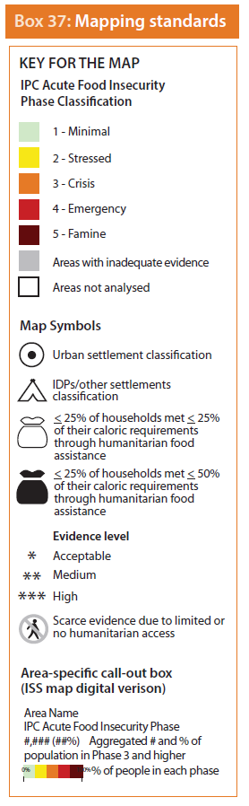
- Areas should be mapped according to the standardized red-green-blue (RGB) colour: Phase 1 (205, 250, 205); Phase 2 (250, 230, 030); Phase 3 (230, 120, 000); Phase 4 (200, 000, 000); and Phase 5 (100, 000, 000).
- Areas are classified and mapped only if they meet the minimum evidence requirements. If requirements are not met, they should be mapped using a grey colour (RGB 166, 166, 166), indicating “inadequate evidence”.
- Areas that are not included in the analysis should be coloured white (RGB 255, 255, 255), indicating “area not analysed”.
- Evidence level of analysis should be added in the map on each area through the use of *Acceptable, **Medium, and ***High.
- In case of classifications of urban areas, IDPs and other settlements, specific symbols should be used as illustrated in Box 37. The colour of the symbol should be chosen according to the phase classified.
- If classification is made with less than adequate evidence in areas with limited or no humanitarian access, a specific symbol should be placed on the concerned area as per Box 37.
- Add symbols for areas identified as having received or that will likely receive significant assistance depending on coverage and size of transfer as follows:
- “white sack”: at least 25% of households met at least 25% of their caloric requirements through humanitarian food assistance
- “black sack”: at least 25% of households met at least 50% of their caloric requirements through humanitarian food assistance
- Digital maps may have further information included. Further information may include the total population in Phase 3 or a more severe phase, IPC Chronic Food Insecurity and IPC Acute Malnutrition classifications, the recurrence of crisis, and population distribution per phase.