


IPC Icon Guidelines 2023
We are pleased to announce that the complete PDF guide for IPC - Integrated Food Security Phase Classification icons is now available for download. This guide not only provides detailed information and illustrations of the IPC icons but also includes valuable instructions for using the appropriate font type to ensure accurate representation. It will enable you to use these icons effectively in your projects related to food security and nutrition analysis.
See our icons in practice: IPC Country Analysis
To access the guide and explore the full range of icons, simply click on the following link: download the IPC Icons guidelines
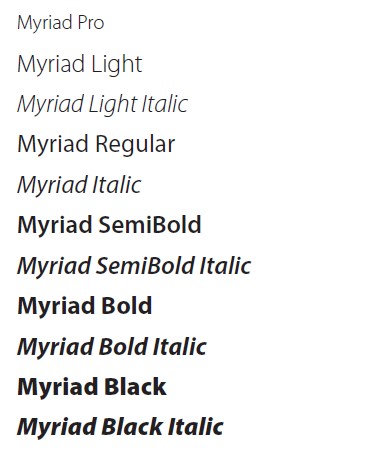
Font type: Myriad Pro
Myriad Pro is the primary and secondary font for the IPC brand. It is a secondary sans serif typeface and has a classic yet fresh appearance. It should be used to communicate a broad range of IPC information products with an exception to the website (Rubik) and MailChimp (Arial).
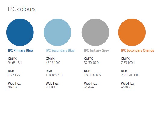
IPC primary colour specifications
Colour is a key element for identifying IPC products and must appear as the dominant colour on everything related to the IPC. Color is a key feature of its visualization and awareness. This guide strictly suggests the IPC primary, secondary and tertiary colors represented in the in this book in order to achieve consistency and brand unity of the IPC’s information products and branded items.
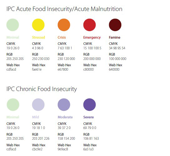
IPC AFI/AMN & CFI classification colour specifications
Colour is a key element in the presentation of the IPC’s analyses. It is absolutely crucial to ensure that all maps and thematic graphs have the same colour coding to ensure consistency and clarity.
IPC AFI/AMN & CFI Icon colour specifications
Colour is a key element in the presentation of the IPC’s analyses. All icons should be in the specified colours for the category.
Icons
Acute Food Insecurity
range of icons has been produced to bring consistency to our visual language when representing the organization’s activities. This is a library of icons which will evolve and expand.
Download IPC AFI Icons PNG pack
Join our mailing list